


 Reply With Quote
looks good oogy. some registrations are on the top such as california, will this affect the design?


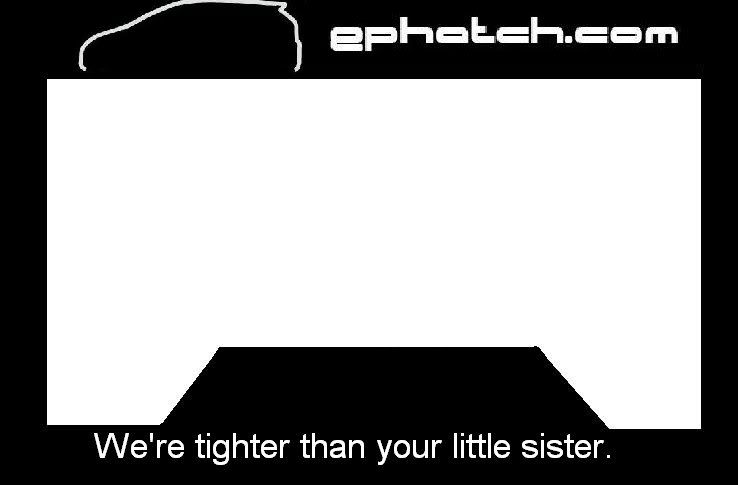
So, I'm hoping to place an order this week. Current quickie (I know my ms paint skill make it look like hell.):
Concerns:
- Probably needs to have the emblem centered on the bottom due to certain state regulations (don't want anyone covering up their registration sticker).
- 2 or 4 hole design? 2 hole up top looks clean but the 4 hole offers better support.
- Do we want anything else up top? Perhaps just a simple "ephatch.com" up top with the outline on the bottom section?
- Outline is allowed to shadow outside of the normal parameters.
- In order to keep costs down and offer these at a reasonable price (under $10 shipped) I would like to have a black frame with white writing.
Feedback is appreciated!
Mel

looks good oogy. some registrations are on the top such as california, will this affect the design?
i like it. plain but clean looking. the top does look a little plain but it's still clean... i know you said your ms paint skills sucks but maybe you can make another one with the ephatch.com on top and leave the outline on the bottom like you suggested so that we can have something to compare too (i don't know if i made sense or not) but yea overall i like it...

looks good to me.

the design looks good and clean. about 10 bucks shipped is very cool. i vote for the 4 hole design. good job mel!

i like...i would buy one!

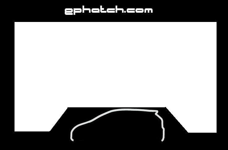
here ya go.
ps. I still like this one

I would like mine to be personally autographed by all of the admins and moderators on ephatch......
I put the phat in Ephatch.
Thanks for the feedback guys.
Similar to this but with text spanning more of the frame?Originally Posted by EP_404349


Mel
Teeth marks count?
Mel
Only if your teeth marks are next to Golans.....
I put the phat in Ephatch.

I want this one!

I like the first one you made the best Mel.
I want "we are tighter than your sister" one
me too, but with ephatch.com going across the top
There are currently 1 users browsing this thread. (0 members and 1 guests)
 Posting Permissions


Bookmarks